
PanamaSospeso
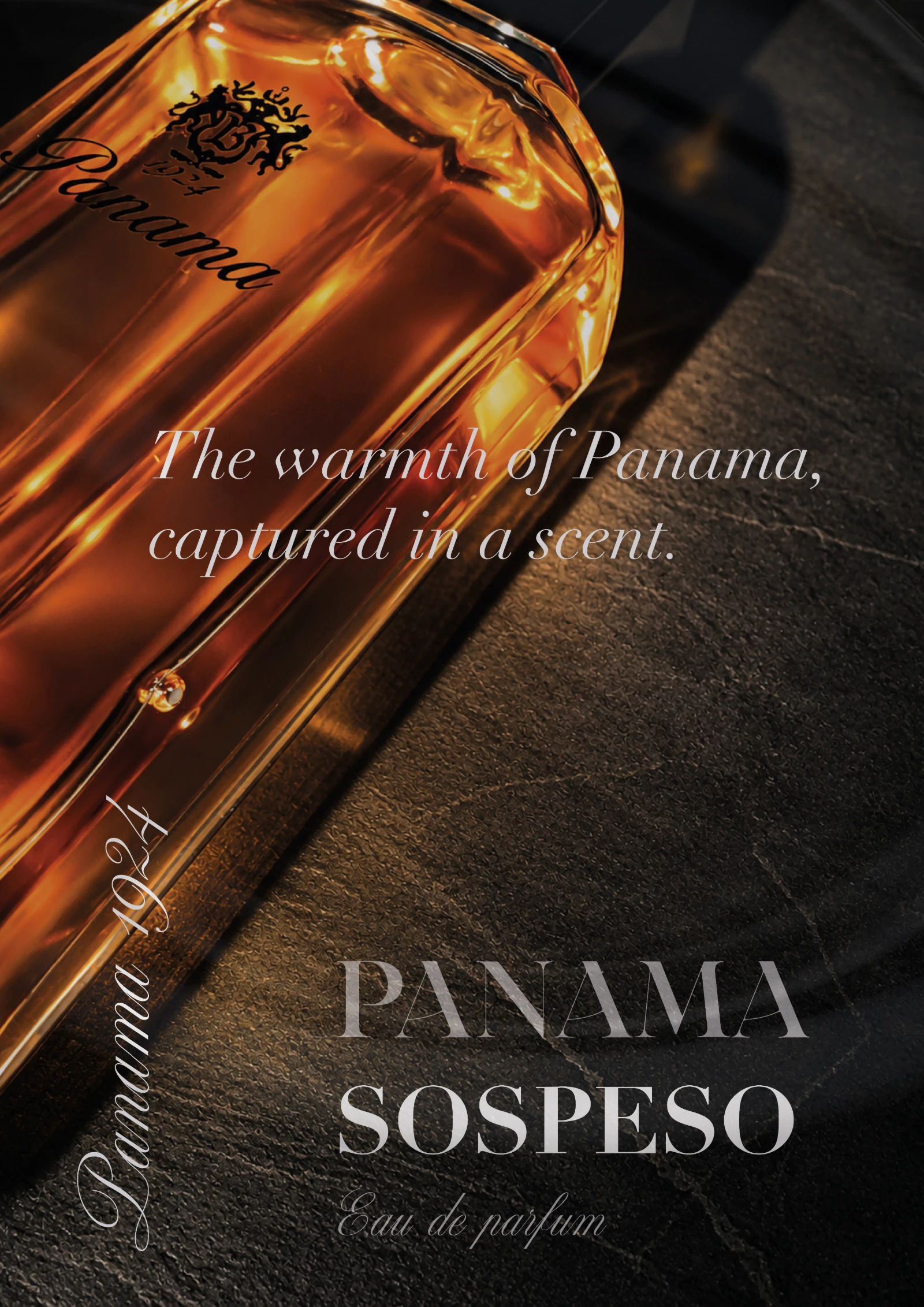
Panama is an existing perfume brand. I used it as a playground for editorial work: one photograph of my own, set three times, each with a different typographic voice.
Editorial study, existing brand
2026
Photography, art direction, editorial design, typography
Own photograph. Background and bottle quality refined with AI and Photoshop
Poster series, A-format
Editorial, campaign
Approach
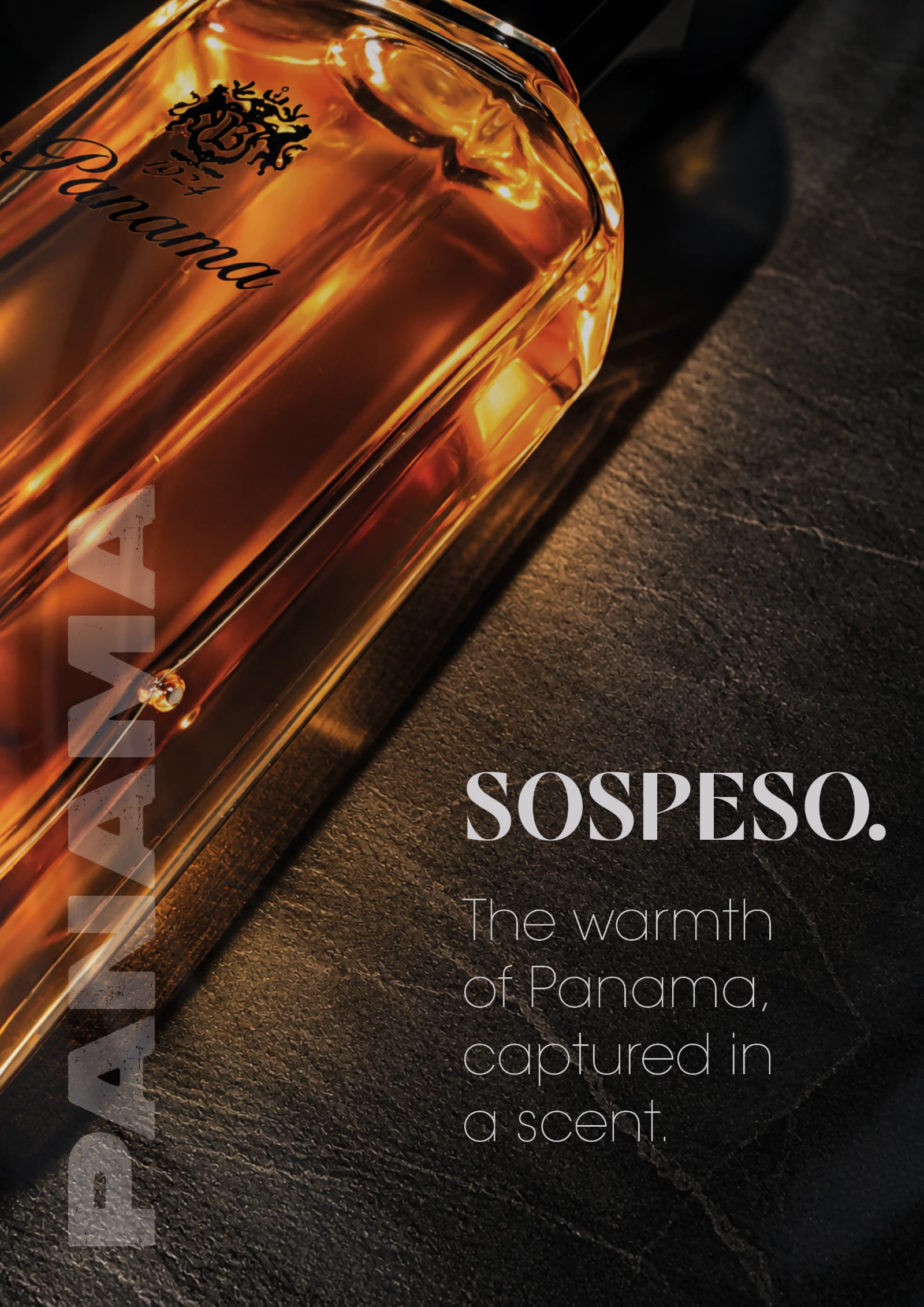
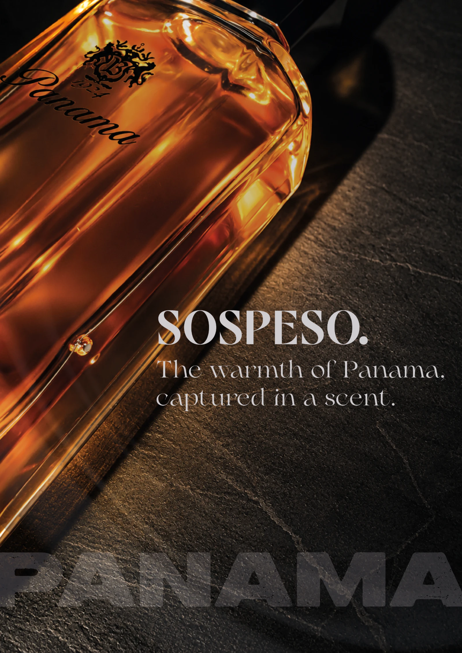
The bottle, warm amber on cold slate, stays fixed. Only the type changes. That makes the series a test of how much a typeface alone decides the character of a product.
The warmth of Panama, captured in a scent. Three times, three tones.
Typography
Version 01 uses an elegant serif with a script signature for a classic perfume voice. Version 02 runs PANAMA vertically in a heavy grotesk with a stone texture, set against a thin sans. Version 03 combines a display serif headline with the wordmark as a grounded baseline.